Contrast, Shading, and Artistic Depth
Black and Grey Tattoos in Queens, NY
Bring depth and character to your tattoo concept through thoughtful shading.
Contrast, Shading, and Artistic Depth
Bring depth and character to your tattoo concept through thoughtful shading.
Black and grey tattoos use variations of dark pigment and shading to create form, texture, and contrast. The style can support dramatic imagery, subtle realism, and detailed compositions without relying on a broad color palette. At Gerlo Style Ink, I approach black and grey tattoo concepts by looking at the subject, the intended mood, and how the shading will support the overall design.
From botanical imagery and sculptural forms to animals and symbolic compositions, this style provides many possibilities. The most effective direction depends on the quality of the references, the intended size, and the balance between dark areas and lighter spaces.
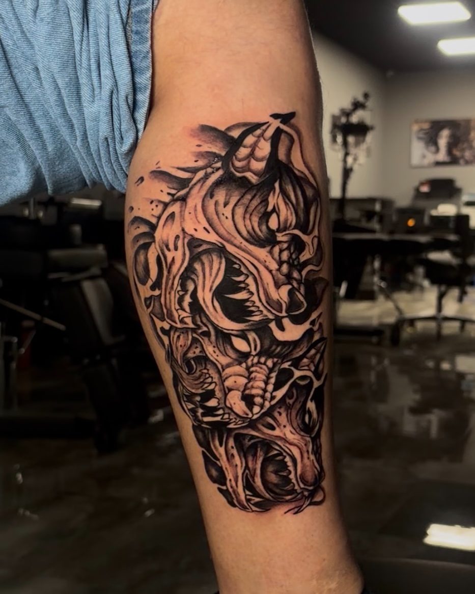
Shading is more than filling empty space. Different values help establish which parts of a subject move forward, which areas recede, and how the viewer understands the image. A strong design uses contrast deliberately rather than treating every section with equal darkness. Black and grey artwork can be realistic, illustrative, ornamental, or a combination of approaches. Before choosing the final composition, consider how much texture is needed and whether the subject will remain recognizable from a normal viewing distance. Extremely dense detail can become less distinct over time.
Flowers and foliage can be developed through soft tonal transitions or stronger contrast. Petal structure, overlapping leaves, and surrounding negative space help establish the shape.
Animals often rely on recognizable facial proportions, fur or feather texture, and balanced shadows. Clear reference photographs support a more informed discussion about size and detail.
Statues, architectural elements, and sculptural forms can lend themselves to black and grey shading. Light direction and shadow placement are especially important when translating three-dimensional subjects to skin.
Objects, lettering accents, meaningful motifs, and background elements can be brought together through consistent tonal treatment. The arrangement should keep the central subject easy to identify.
I consider how dark and light areas work together to define the subject.
I prioritize the main image and its structure before discussing secondary details.
I encourage clear images that show the shapes, textures, and lighting you prefer.
I discuss how scale and body contours may affect the impact of a shaded tattoo.
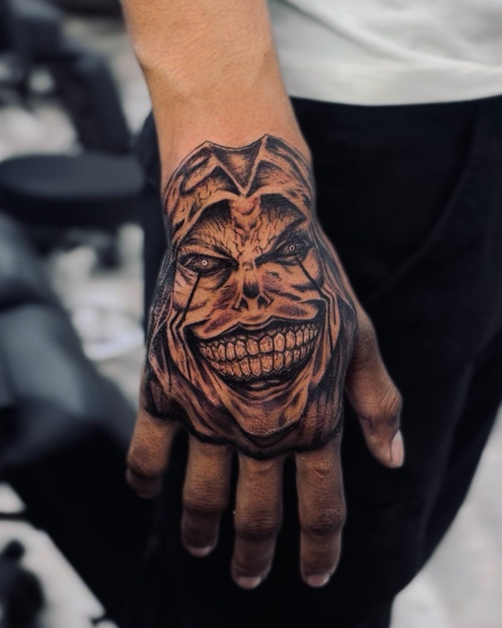
Share your reference images and describe the mood you want for your black and grey tattoo.
Free — no obligations
Share the image, theme, or symbols you want represented.
Discuss whether the work should feel soft, dramatic, realistic, illustrative, or somewhere between those approaches.
Review how shading, negative space, and final dimensions influence readability.
Discuss preparation, potential session structure, and practical details before the work begins.
Follow the supplied aftercare instructions and allow the tattoo to heal before judging its settled appearance.
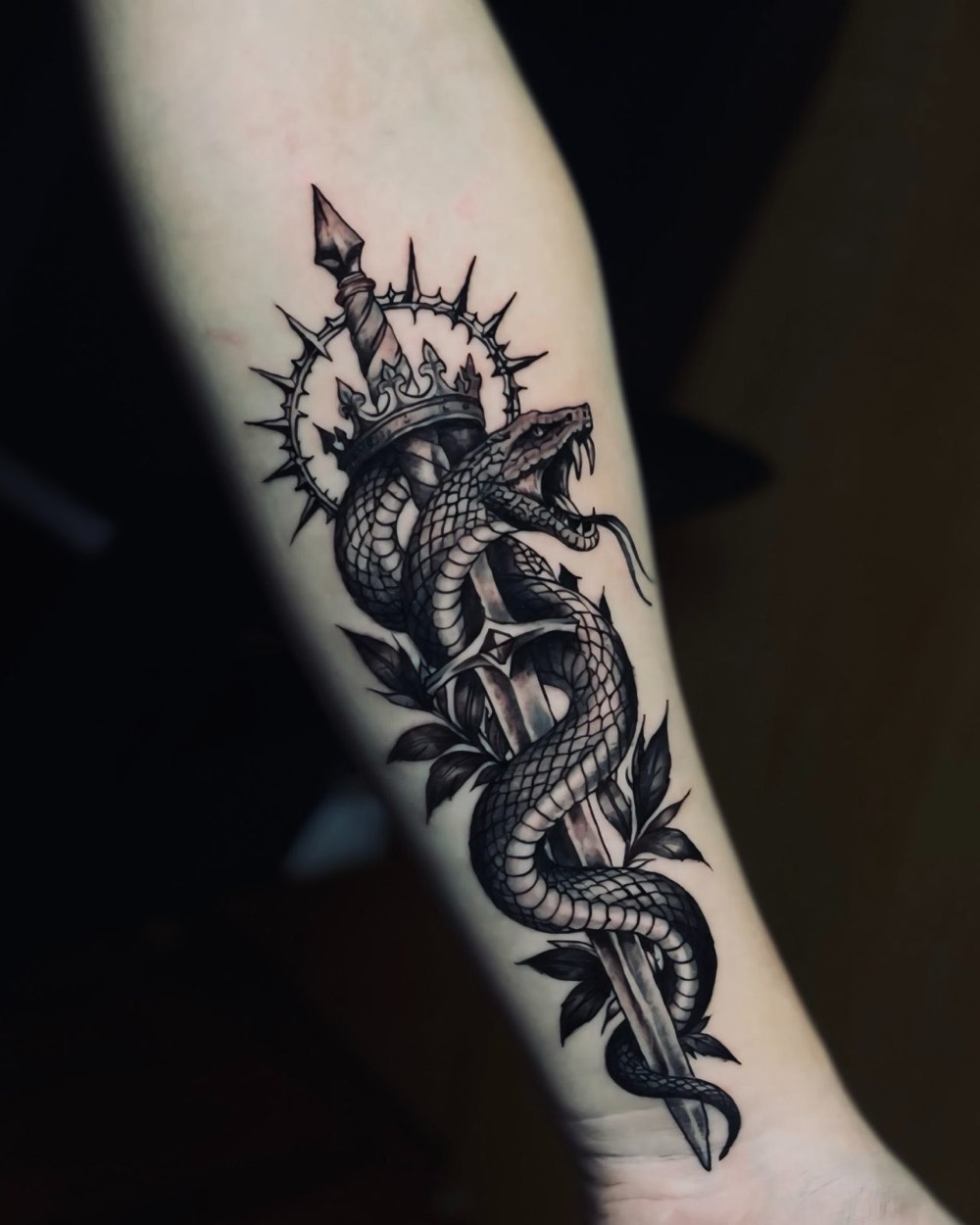
Yes. Recognizable form can be developed using tonal relationships, highlights, and shadow. The design needs enough space and contrast to communicate the important features.
Not necessarily. Many compositions use a range of tones and areas of open skin to create depth. The balance depends on the subject and the desired artistic effect.
Yes. Lettering can become part of a larger composition when the spacing and visual hierarchy are carefully considered. The text should remain readable rather than disappearing into surrounding shadows.
Some projects may benefit from more than one session, while others may be planned differently. The size, complexity, body placement, and amount of shading influence the discussion. Session arrangements should be confirmed for the actual design.